
SESSIONS MAGAZINE
Magazine Design
The design objective was to create a visually compelling magazine cover and inner spreads that effectively communicate the publication's theme and engage the target audience.
PROCESS & OUTCOME
Sessions is a magazine created to uplift underrepresented voices in the roller skating community—centered on storytelling, vibrant visuals, and grassroots energy. Aimed at women, BIPOC, and LGBTQ+ skaters, the magazine champions authenticity, creativity, and connection.
I began the project by researching rollerskating media and publications like Emocean and Thrasher. I designed a bold masthead, established grid systems, and selected imagery that captured the spirit of real skaters. Article titles were generated using AI and real-world sources, and layouts were built with an emphasis on visual flow and clarity.
The final design includes striking covers, editor’s letter, contents page, and internal spreads. Each issue features centered skater portraits with minimal cover text to create an approachable and uncluttered look. A consistent issue-based color system unifies each edition, while playful typography and simple structure highlight the magazine’s ethos. Sessions invites skaters into a space that feels real, inclusive, and unapologetically their own.
-
Empowerment
Sessions celebrates the strength, creativity, and individuality of female roller skaters. Empowerment is at the heart of the brand, as it builds confidence, inspires action, and positions Sessions as a platform where people are seen, heard, and championed.Authentic
The magazine finds its roots in real stories and genuine experiences from within the roller skating community. The tone is raw, honest, and down-to-earth and favors gritty, lived-in truth. Authenticity fosters trust, loyalty, and a sense of belonging, making Sessions feel like a true reflection of the community it serves.Playful
There’s an inherent joy and rhythm to skating that should shine through. Roller skating is full of energy, rhythm, and joy. Sessions embraces that spirit fully. This playfulness adds personality and makes Sessions approachable and emotionally resonant.
Community-Driven
Sessions is not just a magazine, it’s a hub for connection. It brings skaters together through shared stories, collaborative features, and a collective sense of purpose. Being community-driven reinforces the brand’s commitment to inclusivity, representation, and mutual support.Fearless
The skaters featured in Sessions push boundaries and own their space, and the magazine reflects that same fearless attitude. The brand speaks with boldness and conviction, mirroring the daring spirit of the skaters it highlights. This fearless attitude positions Sessions as a trailblazer—unafraid to challenge norms and elevate the culture of skating on its own terms. -
Brand Identity
Magazine Concept
Editorial Design
Social Media
Presentation Design
-
Photoshop
Illustrator
Indesign
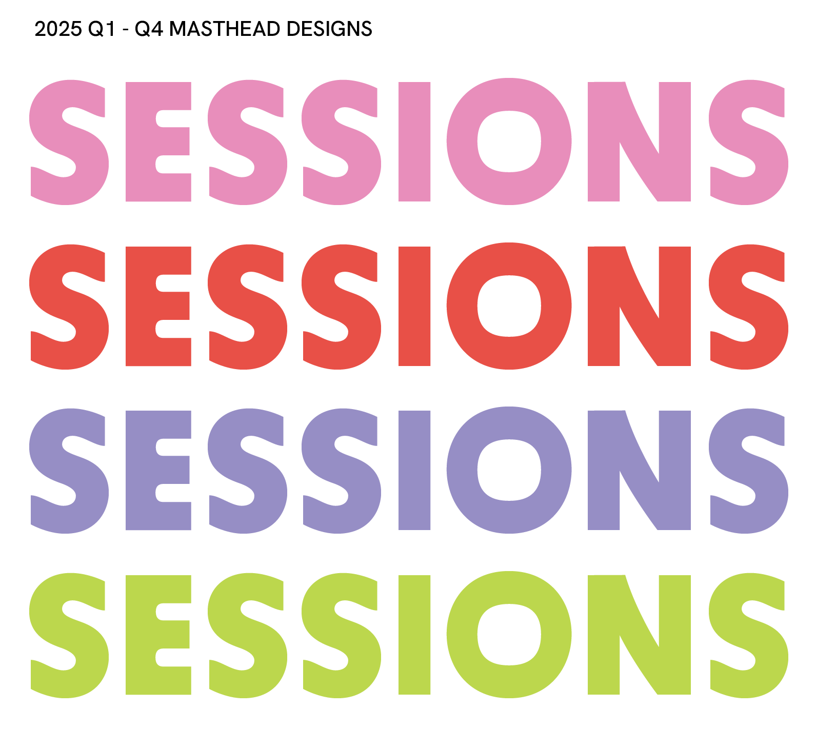
MASTHEAD
The Sessions masthead is set in BD Supper Bold, chosen for its playful curves and approachable feel, which reflect the welcoming nature of the skating community. Positioned as a stand-alone element on each cover, the masthead allows the featured imagery and quarterly theme to take center stage. The name Sessions references the casual, communal gatherings that define skate culture—capturing both the energy of the moment and the ongoing passion skaters share for their craft.
SESSIONS SPINE SYSTEM
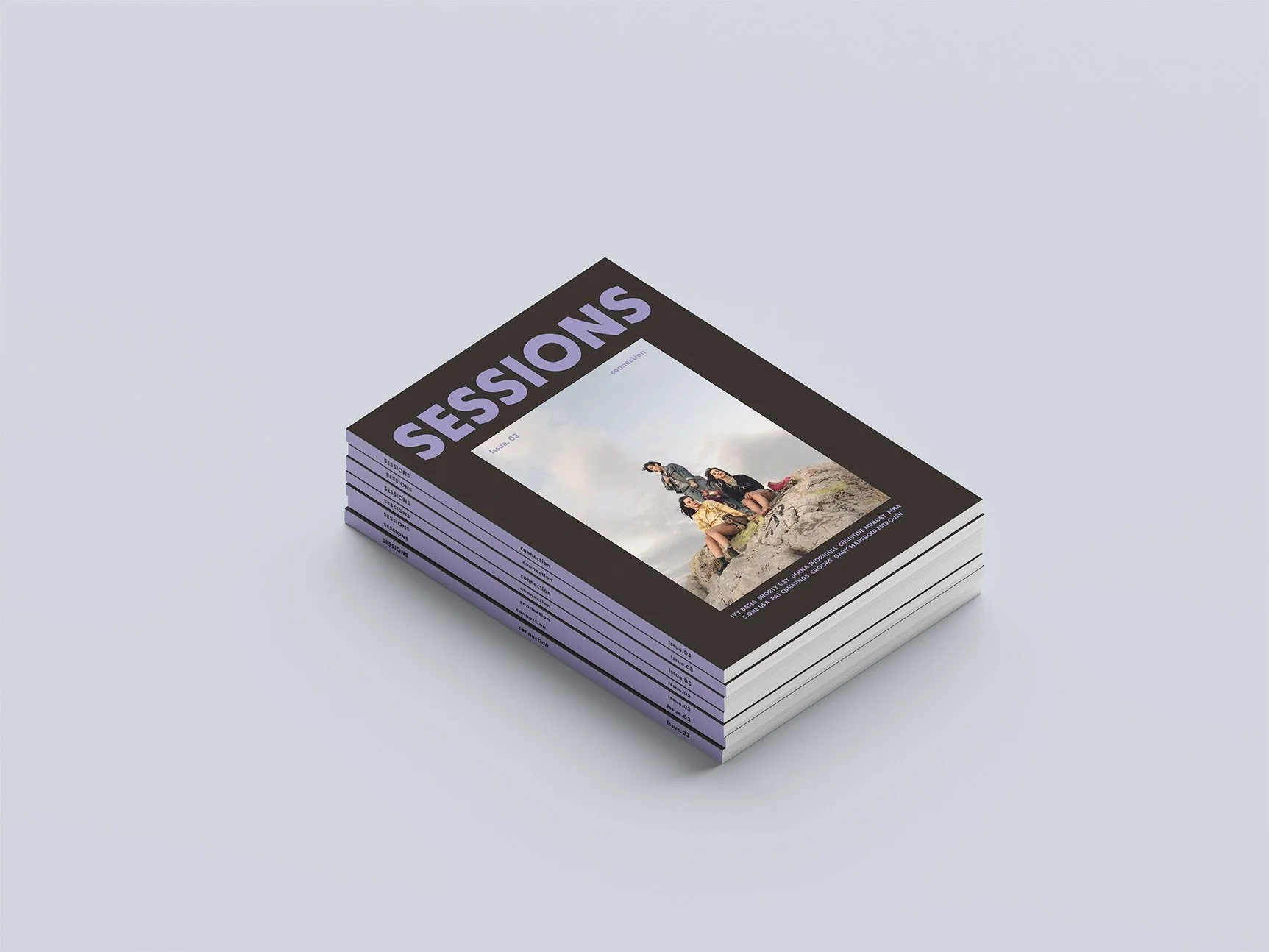
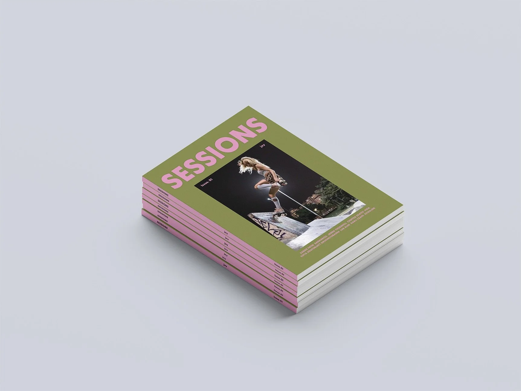
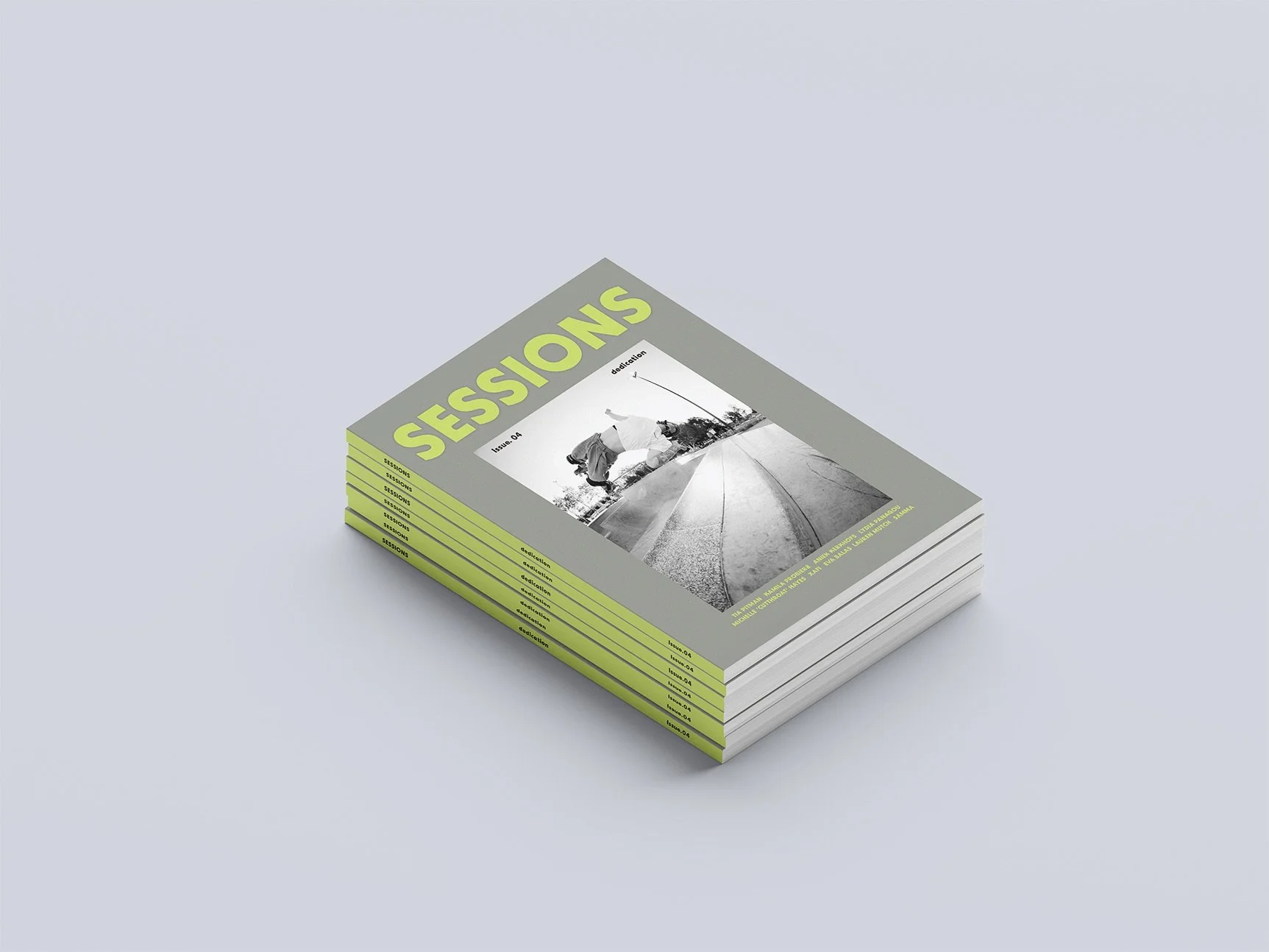
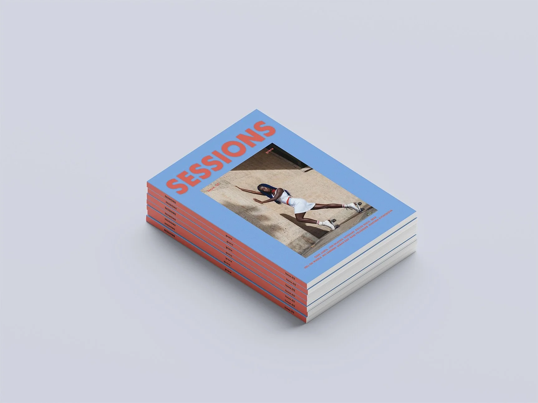
Each quarter, the magazine's spine becomes a vibrant beacon of its core theme—Joy, Grace, Connection, and Dedication. Using bold, distinct colors for each issue, the spines align to form a cohesive visual story across the year. When placed together, the four spines create an organized system that reflects the emotional journey of each theme. This system not only enhances shelf appeal but also invites readers to experience the magazine as a collectible series—each issue a chapter in a larger, intentional narrative.
TYPOGRAPHY
The typefaces were carefully chosen to complement the magazine's bold, energetic aesthetic. BD Supper Bold is used for headers, with its rounded, playful letterforms creating a friendly and approachable tone. Brigade Medium serves as the body text, offering strong legibility with its clean, modern design, while Park Lane Light is used for articles and bylines, adding a touch of elegance with its refined, serif structure.

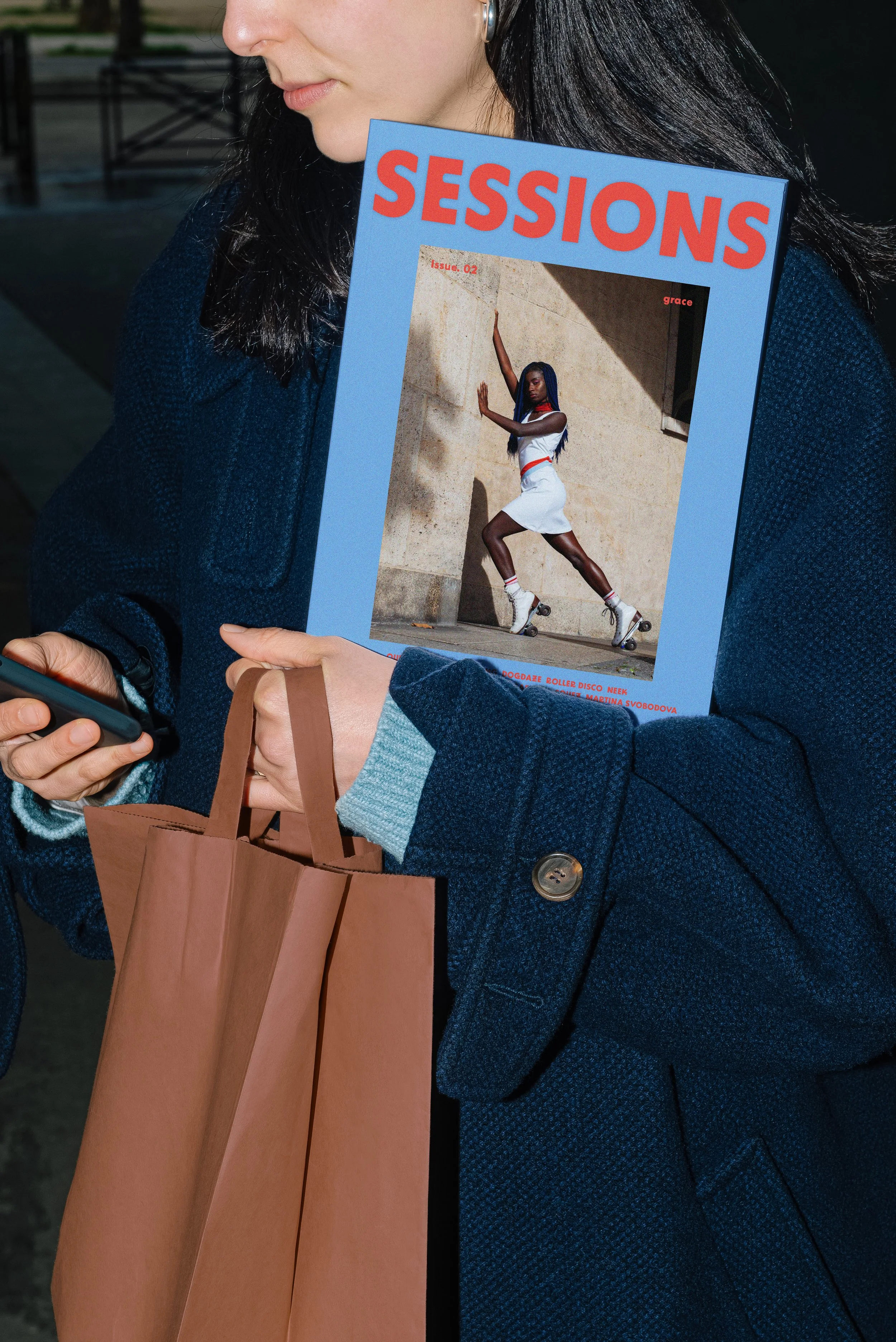
COVER SYSTEM
Sessions is a visually driven magazine that centers each quarterly issue around a distinct theme, brought to life through bold color palettes and carefully curated imagery. Each edition features a standout roller skater whose image graces the cover, reflecting the tone and energy of the theme. With a focus on striking visuals and cohesive storytelling, Sessions captures the dynamic spirit of skating culture and the creative communities that surround it.
Layout Thumbnails
-
![]()
Editor's Letter & Contents (Pg. 2-3)
-
![]()
A Roller Skating Renaissance (Pg. 4-5)
-
![]()
A Roller Skating Renaissance (Pg. 6-5)
-
![]()
Moxi Girl Gang (Pg. 8-9)
-
![]()
Moxi Girl Gang (Pg. 10-11)
-
![]()
Barbie Patin (Pg. 12-13)
-
![]()
Barbie Patin (Pg. 14-15)
-
![]()
Things that bring Us Joy (Pg. 14-15)


INTERIOR SPREADS
The inner spreads of Sessions prioritize figure and form with dynamic compositions showcasing movement and energy. Contrast is key, using bold typography, layered imagery, and scale shifts to maintain visual interest and guide the reader. Repeated graphic elements create a unified design system linked to the magazine’s theme. Vibrant color palettes enhance the issue's tone, reflecting the rhythm and fluidity of skate culture.
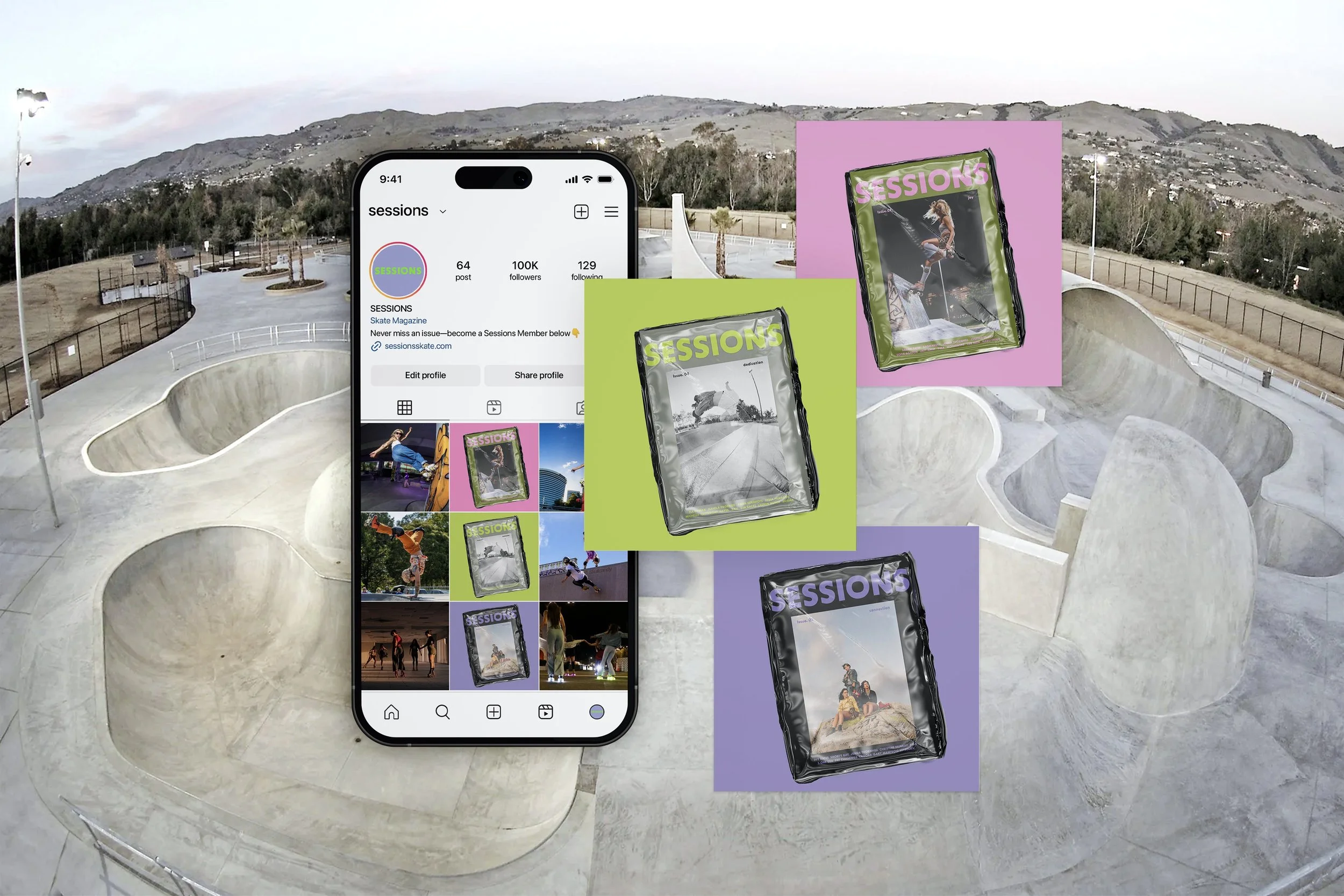
SOCIAL MEDIA
Creating a social media account for Sessions extends the magazine’s visual language beyond print, offering a dynamic platform to showcase each issue’s theme and featured skater. It allows the design system to live in motion, building a cohesive digital presence that mirrors the magazine’s tone. Social media also fosters community engagement, creating space for dialogue, inspiration, and visibility within the skating world and beyond.