
CHICHA
Typeface Design
The design objective for this project was to create a unique lowercase typeface—using found materials as a starting point.

CHICHA MOODBOARD
PROCESS & OUTCOME
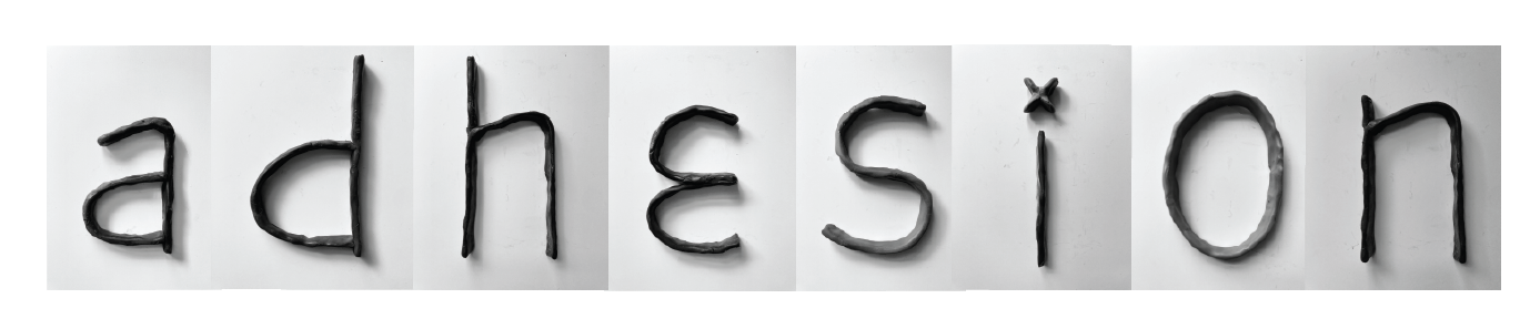
This project began with material experimentation.
I created letterforms using a variety of tools and textures, eventually landing on a clay version of the word adhesion that stood out for its charm and shape language. After analyzing its strongest visual traits and gathering feedback, I began refining the full alphabet in Illustrator, applying those defining elements consistently across each letterform.
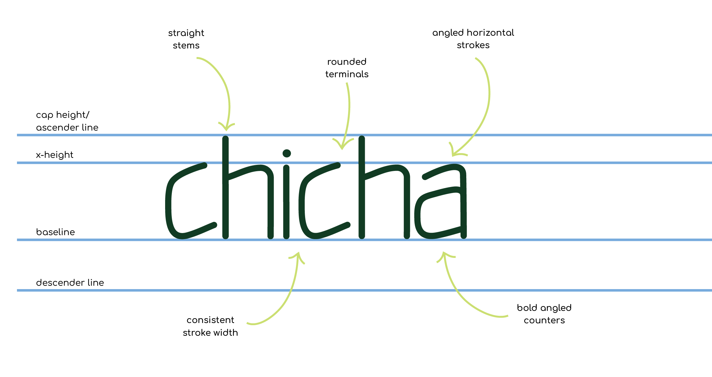
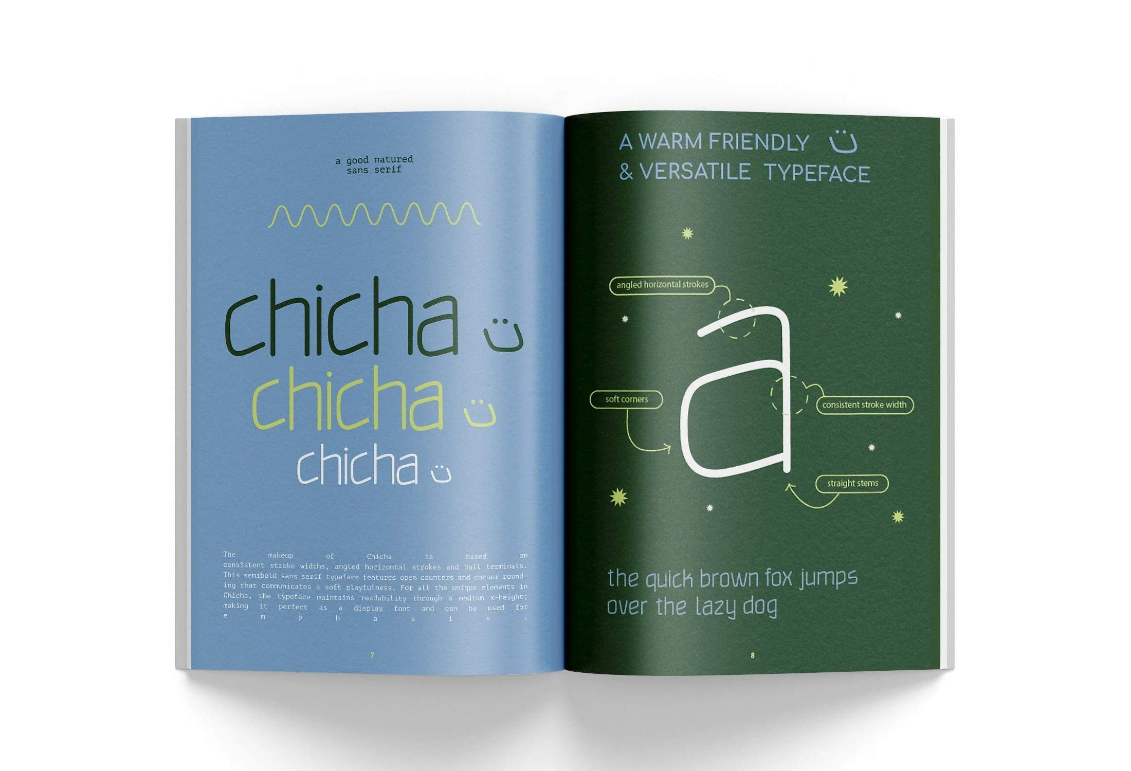
The final typeface is playful yet reliable—ideal for branding, packaging, and poster work. Rounded corners and open counters give it a soft, approachable feel, while angled strokes and consistent structure add strength and clarity—making it both expressive and functional. With its balanced proportions and easy legibility, Chicha brings a friendly human touch to modern typography while staying versatile across applications.
-
Typographic Design
Label Design
Presentation Design
Brand Expansion
-
Illustrator
Photoshop

TYPE SPECIMEN
CHICHA TYPE SPECIMEN
VARIABLES
With three variable stroke width options, Chicha offers flexibility and expressiveness, allowing for a wider range of styles and visual effects. Whether you’re creating food branding, craft packaging, or signage for an upcoming event, this font combines modern characteristics with a friendly undertone, making it an excellent choice for designs that require a warm inviting feeling.

CHICHA TYPEFACE VARIABLES
TYPE SPECIMEN PAGES
These pages display the characteristics and stylistic features of Chicha in real-world contexts, including headlines and body text. The layout serves as both a tool and visual narrative, showcasing Chicha's performance. Chicha is used as the header for a recipe in the second example, serving as a helpful example of how the typeface can bring warmth and personality to everyday content while remaining clear and approachable. This demonstrates its effectiveness in practical, content-driven design.
CHICHA SPECIMEN PAGES
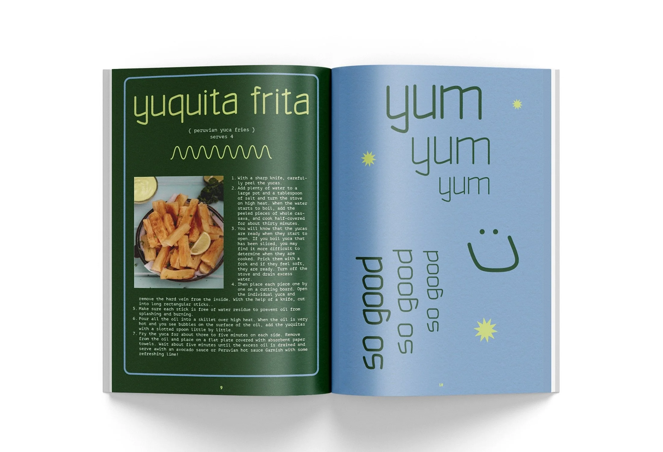
CHICHA SPECIMEN PAGES
chicha
chicha
BRANDING APPLICATION
Incorporating Chicha into food packaging offers a distinct advantage in creating a cohesive and memorable brand identity. Designed with intentionality and cultural nuance, Chicha not only enhances visual appeal but also delivers functional adaptability for this fictitious sauce brand Salsita. Chicha’s unique design instantly sets the brand apart on crowded shelves.
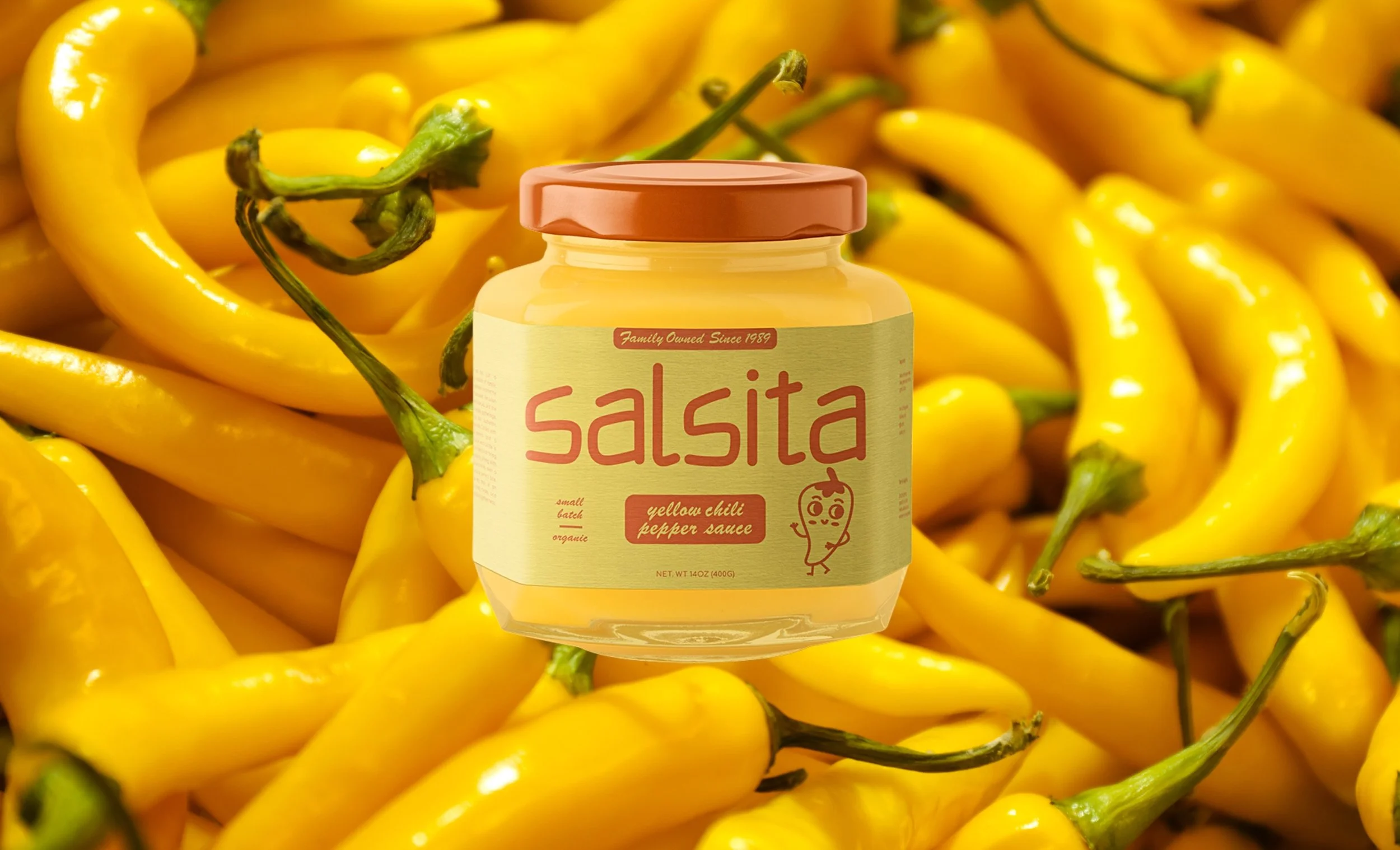
SALSITA PACKAGING LABEL Yellow Chili Pepper Sauce

SALSITA PACKAGING LABEL Lime & Cilantro House Sauce
EVENT APPLICATION
Chicha was used expressively for the SF Art Book Fair, featured in a promotional poster, banner and Instagram post. Its bold character reflects the fair’s experimental spirit and connection to print culture. On the poster, Chicha creates a dynamic, eye-catching layout, while on Instagram, it translated seamlessly into digital—maintaining its energy and capturing attention across platforms. This use highlights Chicha’s versatility and strong visual voice in print and screen-based design.
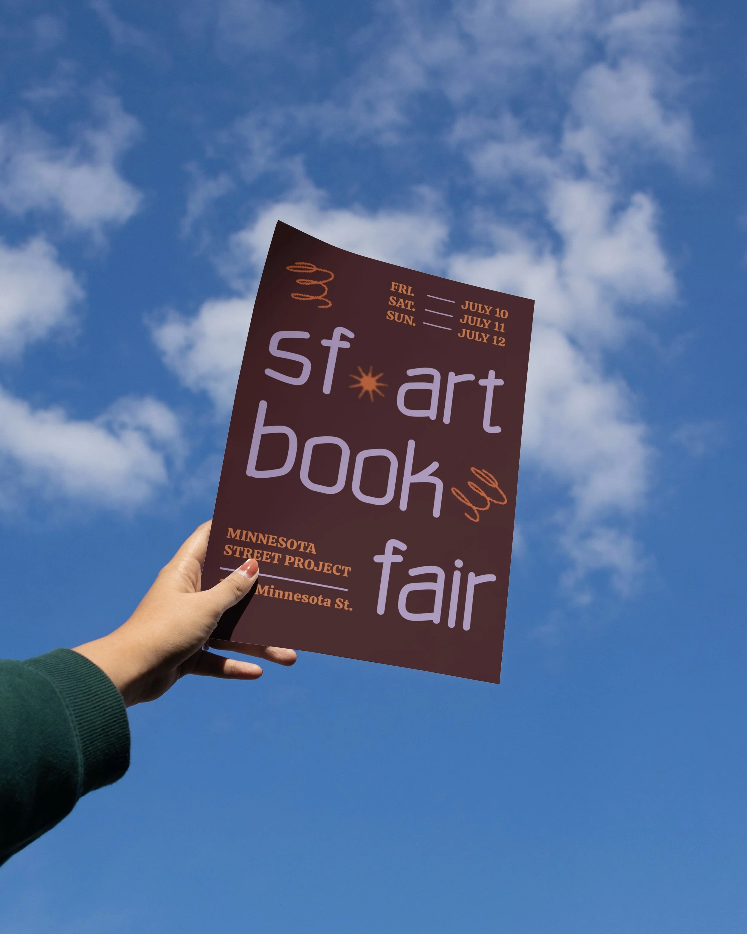
SF ART BOOK FAIR Promotional Poster

SF ART BOOK FAIR Promotional Banner

SF ART BOOK FAIR Social Media Post
TYPE EXPERIMENTATION
Showcasing Chicha through experimental 3D effects emphasizes the typeface’s sculptural qualities and opens up new dimensional possibilities for expression. By pushing the type beyond flat layouts, these treatments highlight Chicha’s form and texture, making it feel tactile, and immersive. When applied at a large scale—such as on signage, murals, or installations—the 3D renderings amplify impact, turning the type itself into a visual centerpiece. This approach highlights Chicha’s adaptability to dynamic environments, and reinforces its potential as both a functional and artistic design element.

READ, BE A GUEST IN OTHER WORLDS Poster

READ, BE A GUEST IN OTHER WORLDS LARGE SCALE MURAL